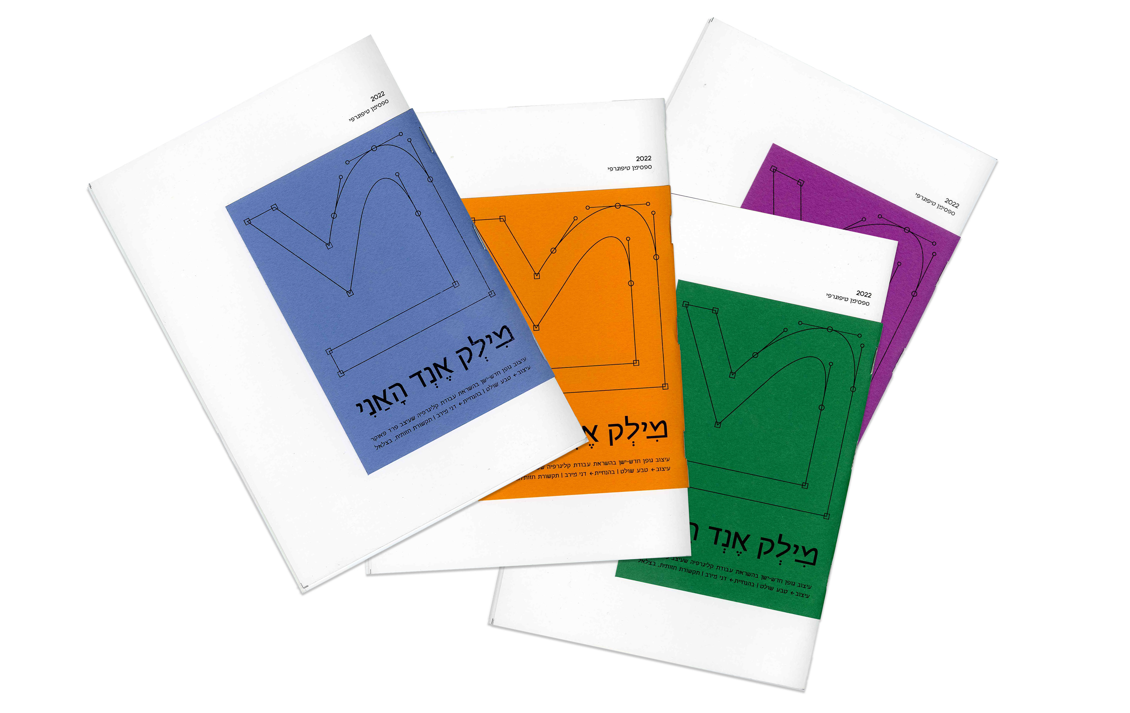
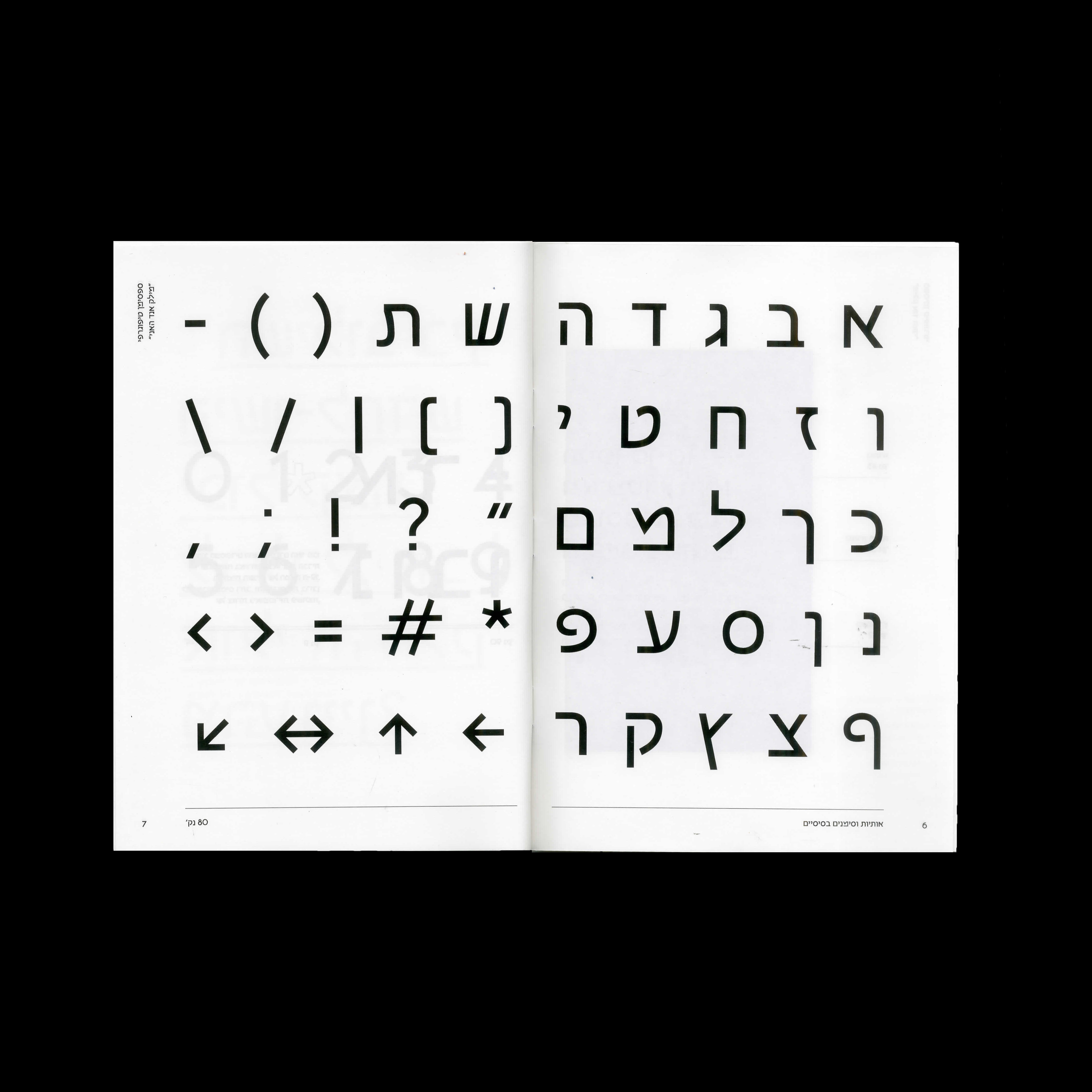
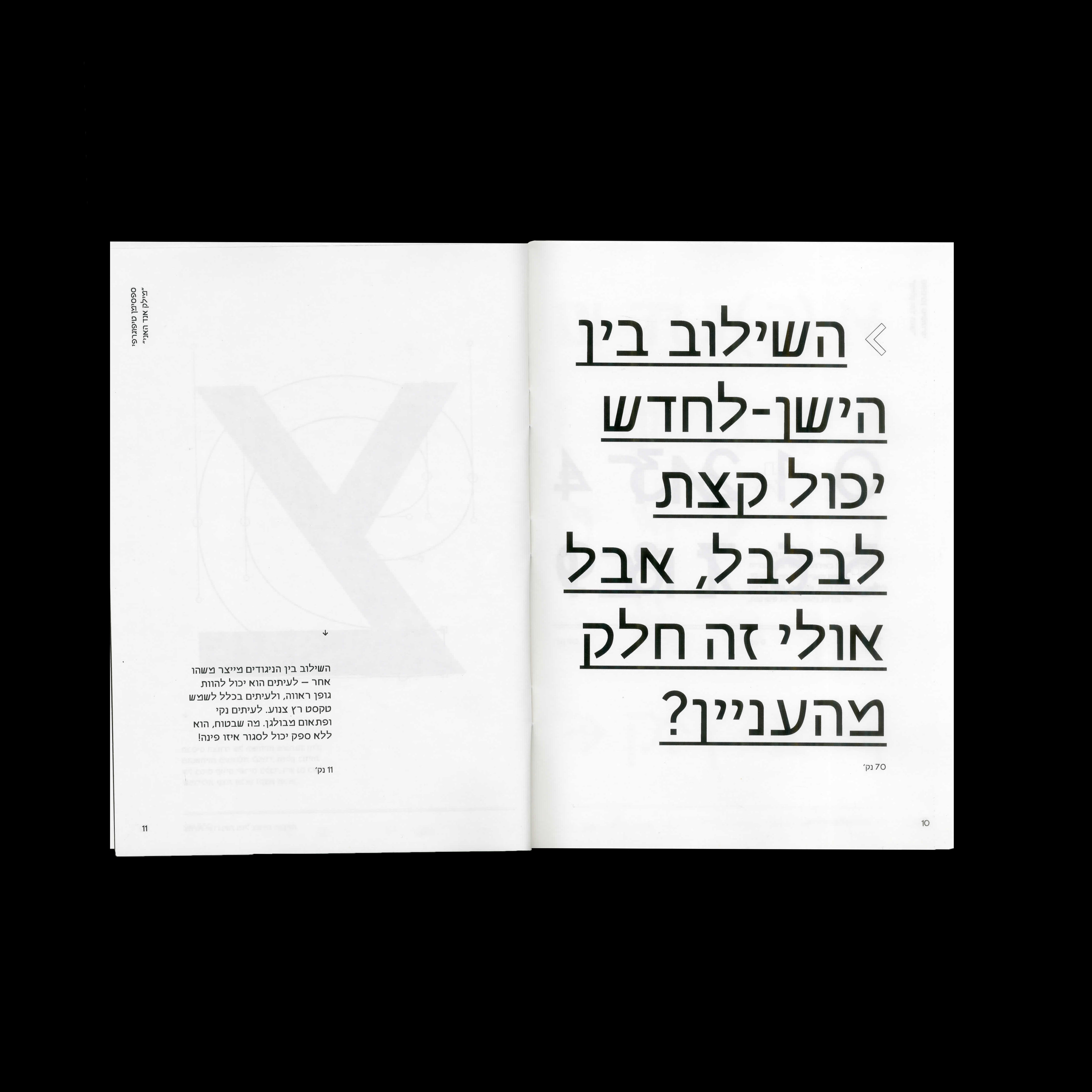
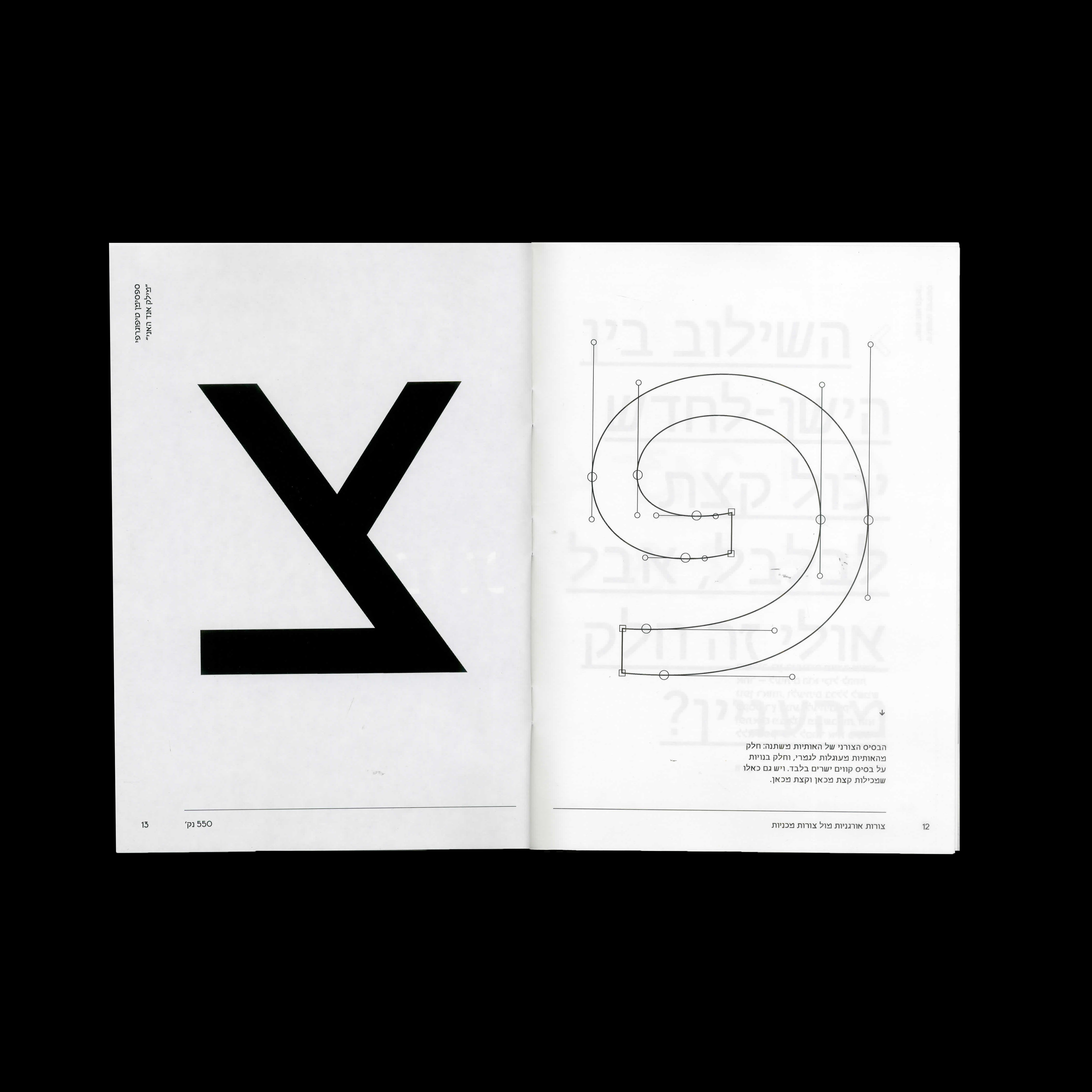
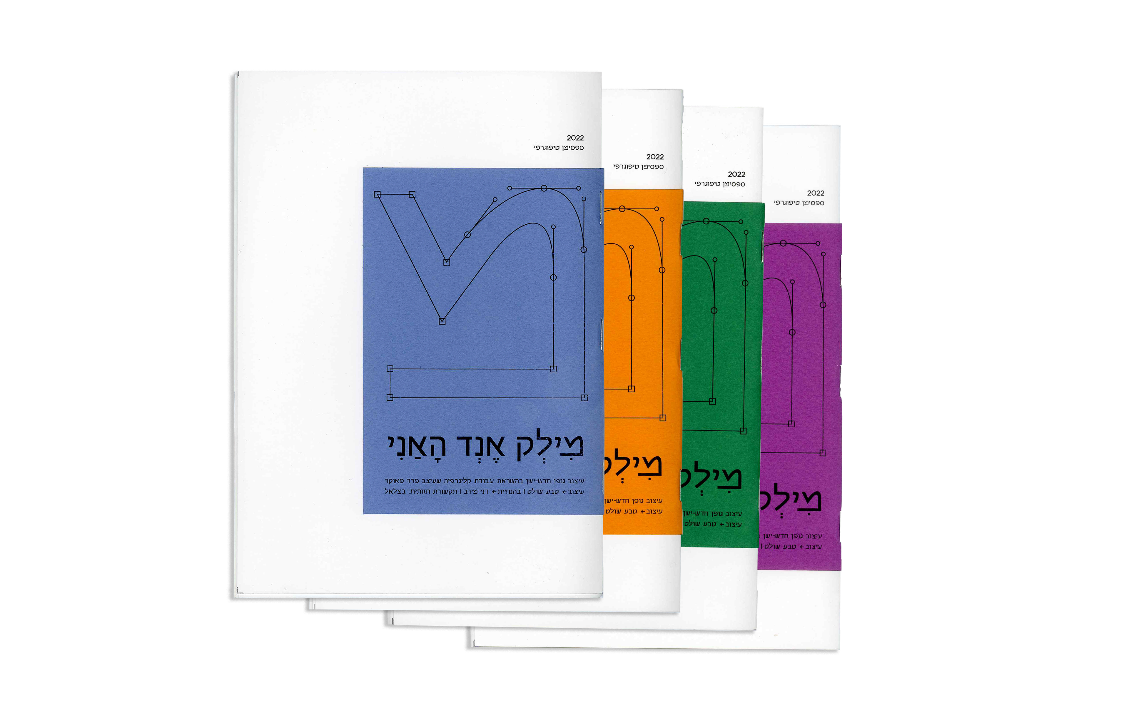
"Milk & Honey" is a new-old letter system inspired by a calligraphic work of Fred Fauker in 1984. The geometric San Serif font is based on simple graphic lines. The letter system contains a range of letter types that are diverse and almost contradictory in their values - some simple and elegant, and some rude and grotesque. The contrast between these two features produces a unique new character. The formal basis of the letters varies: some of the letters are completely rounded, and some are built on the basis of straight and sharp lines.
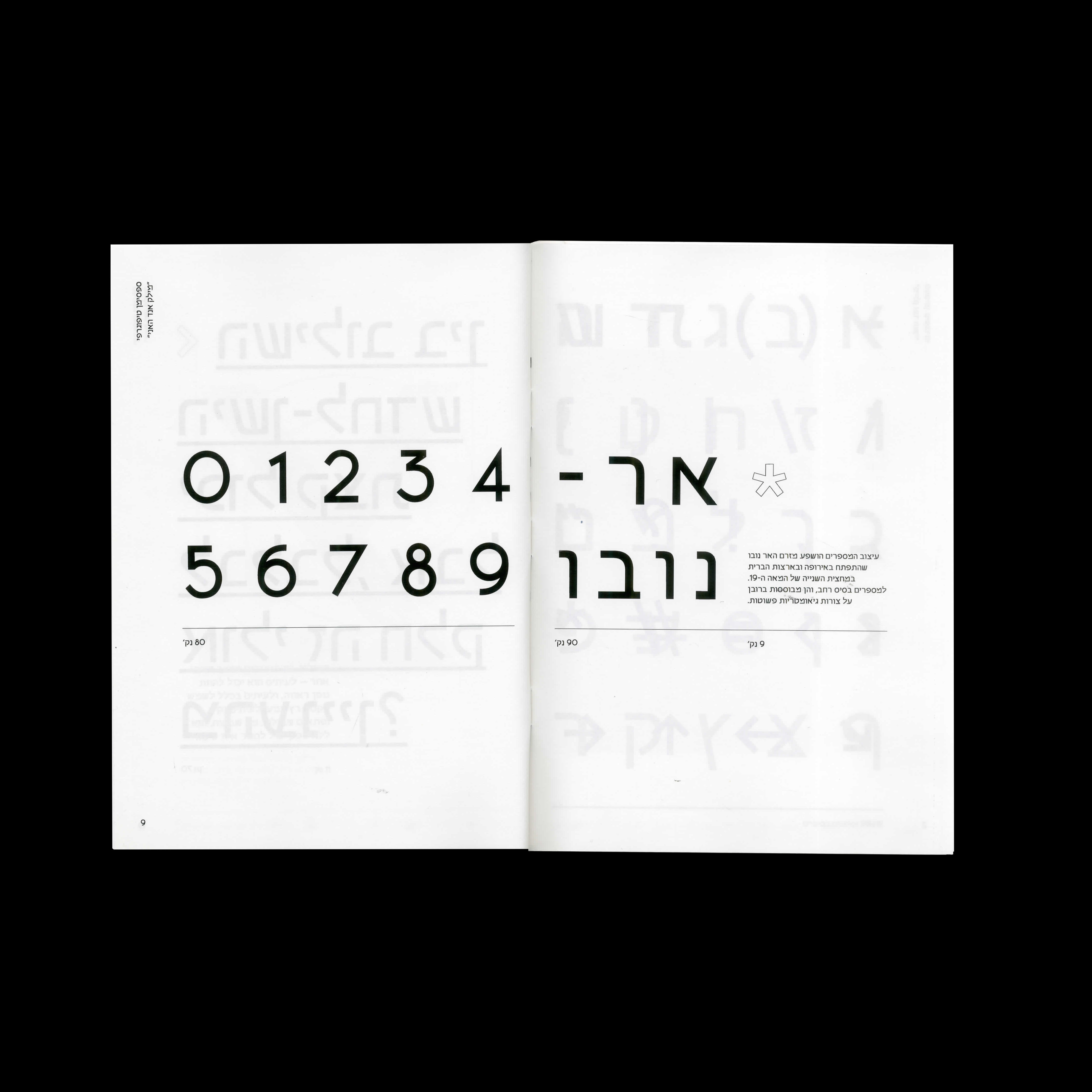
The design of the numbers was influenced by the Art Nouveau period that developed in Europe and the United States in the second half of the 19th century. The numbers have a wide base, and are mostly based on geometric shapes.
The font deals with the subject of innovation parallel to preserving traditions.
Done as part of the "Font Design" course.
Done as part of the "Font Design" course.
Specimen Format: A5